3 Website Fixes That Kill Objections Before They Start
The exact framework we use to turn websites from digital brochures into silent salespeople - for local and service businesses.
See your site fixed - free preview in 48 hours
This isn't a "make it prettier" checklist. It's how you stop losing customers.
- Most local businesses lose customers because their website never answers the objections already forming in a visitor's head.
- These are 3 of the 27 checkpoints we use to fix that.
- You'll probably see your own website in here somewhere.
Lead With the Customer's Ideal Outcome, Not Your Service
Your homepage has about 3 seconds to answer one question: "Can this business solve my problem?"
Most websites open with who they are - their name, their years in business, their mission. But visitors don't care about you yet. They care about the result.
Your hero section should describe the transformation your customer gets, not a description of your company.

Bridge the "Why You" Gap
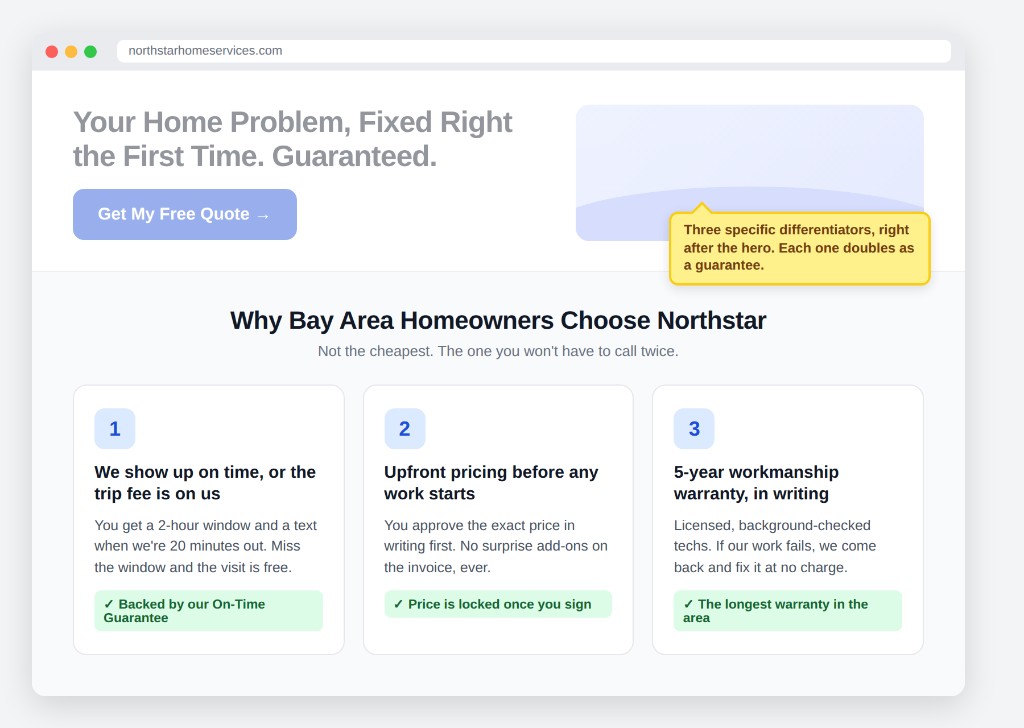
Once someone believes you can get them the outcome they want, their next thought is: "Okay, but why you and not the other five companies that showed up when I searched?"
This is where most websites go silent - and where the customer starts hunting for a reason to trust you, or a reason to leave.
Three clear, specific differentiators, placed right after your hero section, close that gap. Done right, each one doubles as a small guarantee.
Already seeing gaps on your site?
We'll show you exactly where you're losing customers - and build a free preview of what it looks like fixed.
Get My Free PreviewKill the Price Objection Before It Forms
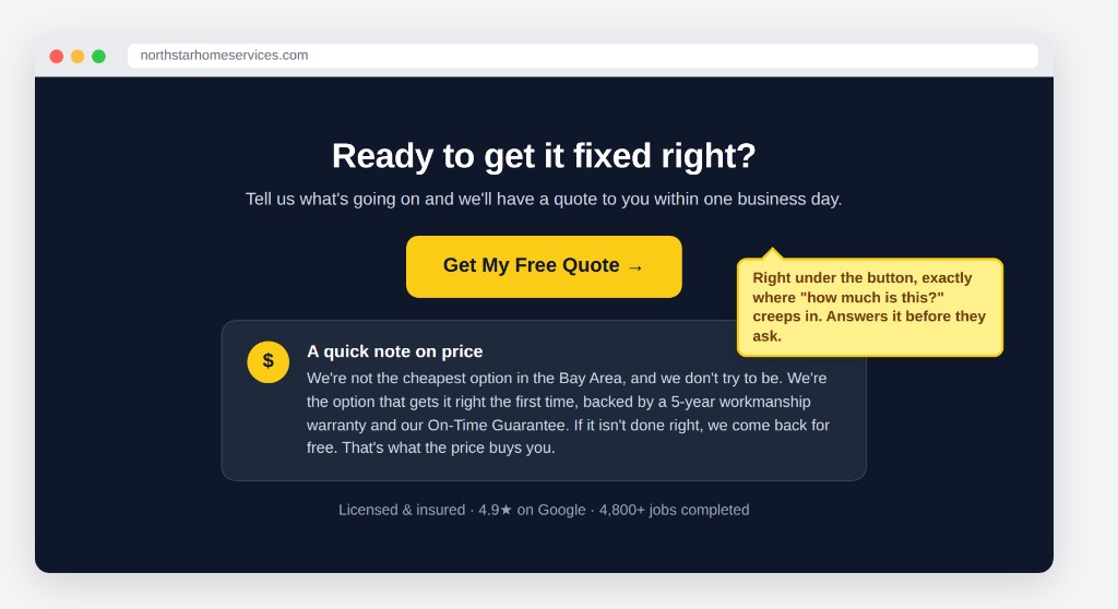
Right under your call-to-action button - the moment someone's about to reach out - is exactly where the "how much is this going to cost me" thought creeps in.
Instead of letting that thought sit there unanswered, address it directly: you're not the cheapest option. You're the best one, and you guarantee it.
Customers don't need the lowest price. They need a reason the price is worth it.
Make It Effortless to Reach You
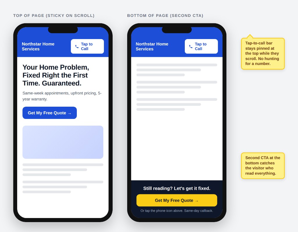
A sticky, tap-to-call phone number at the top of the page for mobile visitors, and a second call-to-action at the bottom of the page.
Two clear paths to contact you, with zero extra scrolling or searching required.
Want to see exactly what this looks like for your business?
Every day your website sits unoptimized, potential customers are viewing it, hesitating, and leaving - for a competitor who answered the question you didn't.
We'll show you where you're losing customers - and build a free preview of what it could look like fixed.
No upfront costPreview in 48 hoursOnly pay if you love it
Spots are limited each week - these previews are built by hand, not templated.
Ready for your free preview?
Get started →